Threshold Economics: Making the First Three Metres of Your Shop Earn Its Floor Space
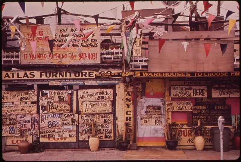
Photo: John Messina, Public domain, via Wikimedia Commons
Walk into almost any small UK shop and count the first three metres. In many, that zone holds a stack of delivery boxes, a rack of reduced stock and a fire extinguisher. It is the space customers cross while their eyes adjust and their pace slows, and it is routinely treated as leftover floor rather than selling floor. Rent is charged on it all the same.
What the entrance zone is actually for
The decompression zone is a transition. Customers arriving from a bright street or a busy pavement need a moment to adjust to the lighting, register the shape of the shop and decide whether to commit to a lap of it. This is not wasted time — it is the moment in which the store is read. If the reading is "cluttered, unclear, awkward to move through", the visit shortens. If it is "spacious, legible, something worth looking at", the visit lengthens.
That gives the zone two jobs, and they are equally commercial: to slow people down, and to orient them.
The low-fixture rule
Height is the controlling variable. Anything tall placed in the first few metres becomes a wall, and a wall at the entrance hides the rest of the shop from the person best placed to buy from it. Keep the fixtures here low — tables, low display plinths, a mid-height unit set well to one side rather than centre — so that a customer standing on the threshold can see across the floor to the back wall.
Depth of sightline matters as much as height. A clear view to the rear wall makes a small shop feel considered and a large one feel navigable. If a customer cannot see where the shop ends, they rarely walk to find out.
Sightlines are a layout question, not a tidiness question
Stand at the door at opening time and photograph what you see. Then repeat the exercise at a busy point in the afternoon. If the two images differ mainly because of people, your sightlines are fine. If they differ because of cages, overspill or a promotional bin that migrated, the layout is fighting the operation.
Pay attention to corners. A queue barrier, a charity collection box, a free newspaper stand or a leaflet rack positioned just inside the door all consume the small amount of clear floor the zone needs. Each may be individually justified; together they can strangle the entrance.
Signage should orient, not decorate
Entrance signage has one job in a small store: tell someone who has never been in before what the shop is and where the main things are. That generally means fewer messages, larger type, and placement above or beside the customer's line of sight rather than in the middle of it.
Useful prompts for the first three metres include a short statement of the offer, a directional cue for the most-visited category, and a single callout for anything time-limited. Anything else is decoration. If a poster in the entrance zone has been there since a promotion that ended, it is not signage; it is clutter with a frame.
The rotating seasonal table earns its keep
The strongest single addition to most entrance zones is a low table — around 700 to 750mm high — dedicated to a rotating display. It works because it is low enough to preserve sightlines, wide enough to hold a deliberate edit, and easy to change weekly.
Rotation is the point. A table that changes with the season, the promotion or the weather signals that the shop is alive, and it gives regular customers a reason to look at the front of the store rather than walk past it. Keep the edit tight: one theme, a handful of products, clear pricing, replenished daily. A table loaded with everything communicates nothing.
In practice, this is a seasonal trading habit as much as a fixture decision. Set the themes for the year in advance — back to school, autumn, festive, January, spring — and let the table carry each of them.
A before-and-after audit for small stores
The method below can be completed in under an hour and repeated after any change.
- Photograph the view. Stand in the doorway, at eye height at 1.6m, and take three photographs: straight ahead, 45 degrees left, 45 degrees right.
- Measure the clear depth. Note how far into the shop you can see without obstruction, along the main axis. Record it in metres.
- Count the obstructions. List every object standing within three metres of the door, with its height and purpose.
- Trace the first decision. Ask a colleague who has not been in the shop to walk in and say where they would go first and what they think the shop sells. Note the hesitation.
- Test the tilt. Weak signage often fails because it sits too low.
- Record the baseline. Note sales from the entrance-zone products and total transactions over one week. This is the only genuinely useful comparison for the after picture.
- Change one thing at a time. Clear the obstructions first, then lower or reposition fixtures, then adjust signage, then install the rotating table. Changing everything at once tells you nothing about what worked.
- Re-audit four weeks later. Repeat steps one to four and compare the photographs side by side. Photographs persuade where opinions do not.
Where it usually goes wrong
Three failures recur. The first is using the zone for storage because it is convenient. The second is filling it with discount stock, which trains regular customers to head straight for the entrance and ignore the rest of the shop. The third is treating the entrance as a display opportunity for the owner rather than a wayfinding aid for the visitor.
The remedy is rarely expensive. In most stores, the entrance zone improves through subtraction, a lower fixture and a single well-lit table. The floor space was always going to be paid for; the only question is whether it earns anything.